 listicle
7 Best Warm Neutral Paint Colors for 2026
Table of Contents
- Why Warm Neutral Paint Colors Still Win in 2026
- 1. Sherwin-Williams Accessible Beige SW 7036
- 2. Sherwin-Williams Perfect Greige SW 6073
- 3. Sherwin-Williams Universal Khaki SW 6150
- 4. Sherwin-Williams Alabaster SW 7008
- 5. Benjamin Moore Manchester Tan HC-81
- 6. Benjamin Moore Edgecomb Gray HC-173
- How to Test Paint Colors on Walls Before You Commit
- 7. Warm White Trim and Ceiling Pairing: A Seventh Shade to Finish the Palette
- Frequently Asked Questions
Last Updated: October 20, 2026
Why Warm Neutral Paint Colors Still Win in 2026
Warm neutral paint colors remain the safest, most versatile choice for any room in 2026, bridging cool gray minimalism and bold trends without dating a space. Warmth makes a room feel lived in. A warm neutral is any beige, greige, taupe, or creamy white with yellow, red, or green undertones that keep a wall from reading cold.
1. Sherwin-Williams Accessible Beige SW 7036
Accessible Beige is the closest thing to a foolproof whole-house color on the market. Its Light Reflectance Value of 58 bounces healthy light back into the room while still reading as a true beige, not a white, and its undertones shift with your furnishings rather than fight them.
We recommend it for living rooms and open-plan spaces where one color carries through several rooms. The drawback: in a north-facing room with limited natural light, it can deepen noticeably, so test it on a large sample board first.
2. Sherwin-Williams Perfect Greige SW 6073
Perfect Greige balances gray and beige with soft red-pink undertones. At an LRV of 43, it sits mid-tone, making it a strong pick for bedrooms and cozy dens where walls should feel enveloping rather than bright.
Most guides call greige a safe middle ground, but red-pink undertones can turn purple under low artificial light. Paint a sample and check it at night before committing to a whole room.
3. Sherwin-Williams Universal Khaki SW 6150
Universal Khaki brings an earthy, grounding quality that fits the 2026 push toward warmer, more soulful interiors. It reads as a soft khaki-tan, versatile enough for a home office or hallway that needs presence without drama.
What most reviews miss is how it behaves in small spaces: with minimal natural light it looks darker and heavier than the swatch suggests.
4. Sherwin-Williams Alabaster SW 7008
Alabaster is the warm white we reach for when a client wants brightness without sterility. Creamy yellow undertones keep it soft, and it works on walls, ceilings, and trim, a rare three-in-one shade.
The tradeoff is honest: under very warm artificial lighting, Alabaster can lean slightly yellow. In a south-facing room with plenty of daylight, it stays clean and inviting.
5. Benjamin Moore Manchester Tan HC-81
Manchester Tan is a mid-tone beige with yellow and earthy brown undertones, carrying more character than most neutrals here. It pairs beautifully with natural wood, making it a fit for rooms with oak floors or exposed beams.
Where it falls short: undertones shift with lighting and surrounding decor, so a swatch that looks perfect in the store may read differently at home. Sample it against your actual flooring and furniture first.
6. Benjamin Moore Edgecomb Gray HC-173
Edgecomb Gray is a warm greige from Benjamin Moore's Historical Collection that offers more warmth than a traditional gray while staying balanced, dependable for living rooms and bedrooms where you want a neutral that feels soft rather than stark.
For readers weighing warm neutral paint colors for bedrooms, this is one of our top picks: enough depth to feel calm at night, enough warmth to avoid the clinical look cooler grays create.
How to Test Paint Colors on Walls Before You Commit
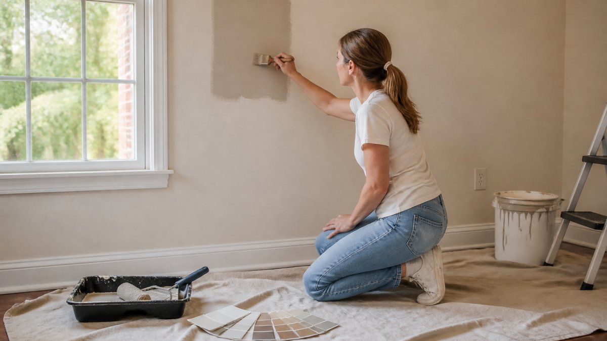
Testing paint colors on walls separates a confident renovation from an expensive mistake. Most guides say paint a sample and "live with it", not enough. Warm neutrals are the most lighting-sensitive family of colors, and the same shade can read creamy in one room and yellow, pink, or flat gray in the next. The method below is built around the two variables that move a warm neutral most: room orientation and light source.
Step 1: Identify your room's orientation before you sample
Stand in the room at midday and note which compass direction the largest window faces. This predicts how a warm neutral will behave more reliably than any swatch photo.
- North-facing rooms receive cool, indirect daylight for most of the day. Warm neutrals here tend to pull toward their cooler side, beiges can read gray, and creamy whites can look slightly dingy. Favor shades with a touch of yellow or green rather than red, and expect to go one step warmer than the chip suggests.
- South-facing rooms receive strong, warm direct light. Warmth is amplified, so a beige with heavy yellow undertones can tip toward gold by late afternoon. Mid-tone greiges and balanced beiges hold up best here.
- East-facing rooms get bright, slightly cool morning light that fades to shadow by afternoon. Warm neutrals often look their truest in the morning and go muddy after 3 p.m.
Step 2: Paint large, movable samples
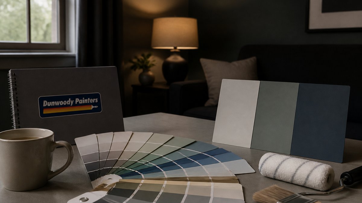
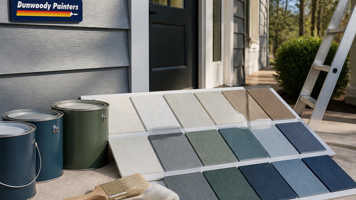
Paint each candidate on a two-foot-square piece of poster board, not the wall, in two coats over white primer. Poster board lets you move the same sample to different walls, hold it against trim and cabinets, and compare shades side by side without repainting. Label the back of each board with the shade name and code.
Step 3: Read the sample at four light moments
Check every board at these four points, and write down what you see at each:
- Morning (8-10 a.m.), cool, low-angle light.
- Midday (noon-2 p.m.), the most neutral reading of the day.
- Late afternoon (4-6 p.m.), warm, raking light that exaggerates undertones.
- After dark with your actual lamps on, this is the test most homeowners skip, and it is where red-pink undertones in greiges most often turn purple.
Step 4: Match the bulb, not just the daylight
Artificial light changes a warm neutral as much as a window does. Rules of thumb:
- 2700K bulbs (warm white, the most common residential choice) push beiges toward yellow and can make creamy whites look buttery.
- 3000K bulbs are closer to neutral and give the most accurate reading of a warm neutral after dark.
- 4000K and cooler bulbs pull warm neutrals toward gray and can make a cozy beige look institutional.
If you plan to keep your existing bulbs, test under those bulbs. If you are renovating the lighting too, test under the color temperature you intend to install.
Step 5: Test against fixed finishes, not just the wall
Hold each board against your flooring, countertops, cabinet fronts, and any stone or tile that will stay. A shade that looks perfect against bare drywall can clash with a red-oak floor or cool gray quartz, a beige too yellow next to white oak, a greige too pink next to warm wood, or a khaki too green next to cool stone.
Room-specific limitations to watch for
- Bedrooms: mid-tone greiges and beiges with an LRV in the low 40s feel enveloping at night but can go heavy in a small, low-light room. Test after dark with the lamps you actually use.
- Living rooms: large rooms with multiple windows are the most forgiving; this is where whole-house beiges earn their reputation.
- Kitchens: warm neutrals compete with cabinet color and under-cabinet lighting. Test against the cabinet door, not the wall, and check under the actual task lighting.
Understanding paint color undertones is the other half of the job. Every neutral carries a hidden hue, yellow, red, green, or violet, that reacts to your room's lighting, flooring, and fixed finishes.
7. Warm White Trim and Ceiling Pairing: A Seventh Shade to Finish the Palette
The seventh shade is not a wall color at all, it is the warm white you pair with everything above. A creamy trim and ceiling white ties the six wall shades together and gives each room a finished, deliberate look instead of a patchwork feel. Most roundups stop at the wall color; that is a mistake, because trim and ceiling white is what makes a warm neutral read as intentional.
Why the trim white matters more than the wall color
Trim, doors, and ceilings occupy a large share of the visible surface and sit right next to the wall color at every edge. A cool, bright white trim against a warm beige creates a hard, high-contrast line that makes the beige look dirtier than it is; a warm white trim softens that edge. A stark white ceiling over a warm wall can likewise make the wall look yellow by comparison.
The pairing rule we use
Match the trim white's undertone to the wall shade's undertone, and keep the trim one to two steps lighter in LRV than the wall. That gives you a clean, deliberate contrast without a jarring jump.
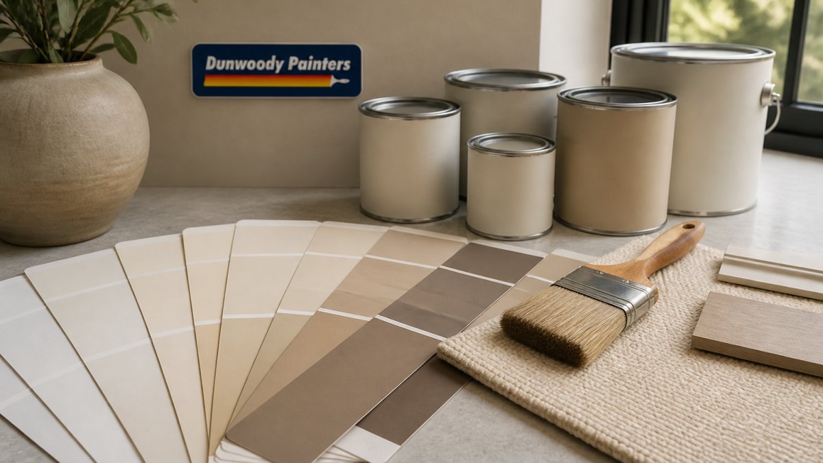
- Against warm beiges (Accessible Beige, Manchester Tan): choose a creamy white with a yellow undertone. A warm white in the low-to-mid 80s LRV keeps the edge soft and stops the beige from reading muddy.
- Against warm greiges (Perfect Greige, Edgecomb Gray): choose a white that is warm but not yellow, a soft off-white with a hint of gray keeps the greige from tipping pink at the trim line.
- Against earthy khakis (Universal Khaki): choose a warm white with a touch of green or cream so the khaki reads as intentional rather than dated.
Ceilings, doors, and the whole-home rule
Use the same trim white on ceilings, doors, and casings throughout the home. Consistent trim color makes a whole-home neutral palette read as intentional and makes future touch-ups easier, you match one white, not five. For a taller-feeling ceiling, take the ceiling white one step lighter than the trim; for a cozier room, keep them the same white.
Coordinating flooring and fixed finishes
Trim white is also your bridge to the finishes you are not changing. Warm wood floors, white oak, red oak, hickory, pair best with creamy whites that echo their warmth. Cool gray flooring and gray-veined stone pair best with a soft off-white carrying a hint of gray, which keeps the warm wall from fighting the cool floor.
If you are planning a full interior refresh and want the shades tested and applied correctly the first time, our team at Dunwoody Painters handles color consultation, surface prep, and clean application with background-checked crews and a written two-year workmanship warranty. Sherwin-Williams color resources and Benjamin Moore's color guidance are useful starting points for ordering samples, and the U.S. Environmental Protection Agency publishes guidance on low-VOC interior paints worth reviewing before you buy.
| Shade | Brand | Tone | LRV | Best For |
|---|---|---|---|---|
| Accessible Beige SW 7036 | Sherwin-Williams | Warm beige | 58 | Whole-house, living rooms |
| Perfect Greige SW 6073 | Sherwin-Williams | Warm greige | 43 | Bedrooms, cozy spaces |
| Universal Khaki SW 6150 | Sherwin-Williams | Earthy khaki | Not listed | Offices, hallways |
| Alabaster SW 7008 | Sherwin-Williams | Warm white | Not listed | Walls, ceilings, trim |
| Manchester Tan HC-81 | Benjamin Moore | Mid-tone beige | Not listed | Rooms with wood floors |
| Edgecomb Gray HC-173 | Benjamin Moore | Warm greige | Not listed | Living rooms, bedrooms |
| Warm white trim | Any quality line | Creamy white | Not listed | Trim, doors, ceilings |
Frequently Asked Questions
Which warm neutral paint colors work best in rooms with low natural light?
Rooms with limited natural light need warm neutrals with a higher Light Reflectance Value so the walls do not go muddy. Alabaster SW 7008 and Accessible Beige SW 7036 both hold their warmth without turning gray in dim corners. Avoid deeper greige tones like Perfect Greige SW 6073 in north-facing or basement rooms, where its red-pink undertones can read stronger than expected. Always test a sample on the actual wall before committing.
How do I choose between beige, greige, and warm white paint?
Start with the fixed finishes in the room. Warm wood floors and natural materials lean toward beige like Manchester Tan HC-81, while gray-toned floors and modern furniture pair better with a greige like Edgecomb Gray HC-173. Warm white such as Alabaster SW 7008 works as a whole-home base when you want brightness without starkness. Compare samples side by side on the same wall so you can see how the undertones shift next to each other.
How can I test a warm neutral paint color before painting a room?
Paint a sample board or a large patch directly on the wall, at least 2 feet square, and leave it for two to three days. Check it in morning light, afternoon light, and at night with the lamps on. Warm neutral paint colors shift noticeably between cool daylight and warm artificial light, so a shade that looks perfect at noon can read yellow or pink after dark. Testing on the actual wall beats a paper swatch every time.
Do warm neutral paint colors work with wood floors and white trim?
Yes, and the pairing is one of the most reliable in interior painting. Warm neutrals like Accessible Beige SW 7036 and Manchester Tan HC-81 complement medium and warm-toned wood floors, while a soft white trim such as Alabaster SW 7008 keeps the contrast clean without feeling cold. Match the trim's undertone to the wall color: a creamy white against a warm beige looks intentional, while a stark white can make the beige look dingy.
Choosing a warm neutral is really a decision about how your home should feel, and the wrong undertone can undo months of planning. Dunwoody Painters takes the guesswork out of that decision with detailed, line-by-line estimates, premium materials, and a no-payment-until-complete policy backed by a written two-year workmanship warranty. Schedule a free estimate with Dunwoody Painters and get your palette tested, prepped, and painted right the first time.