 listicle
Are These the Best Paint Colors for Low Light Rooms in 2026?
Last Updated: October 25, 2026
Quick Summary
The best paint colors for low light rooms are warm whites, soft neutrals, and muted greens that reflect the daylight you have instead of absorbing it. Alabaster, Soft Chamois, October Mist, Marshlands, Seashell, Gravel Gray, and Chippendale Rosetone each carry enough warmth or depth to survive a dim room. Test your shortlist on the actual wall at three times of day before committing.
- North-facing rooms should lean warm, since cool indirect light pulls cool colors toward blue-gray.
- Choose warm whites with a touch of cream or beige, not bright whites with blue undertones.
- Use matte walls with eggshell trim in the same color for washability without glossy reflection.
- Replace cool-white bulbs with warm-white LEDs in the 2700K to 3000K range before painting.
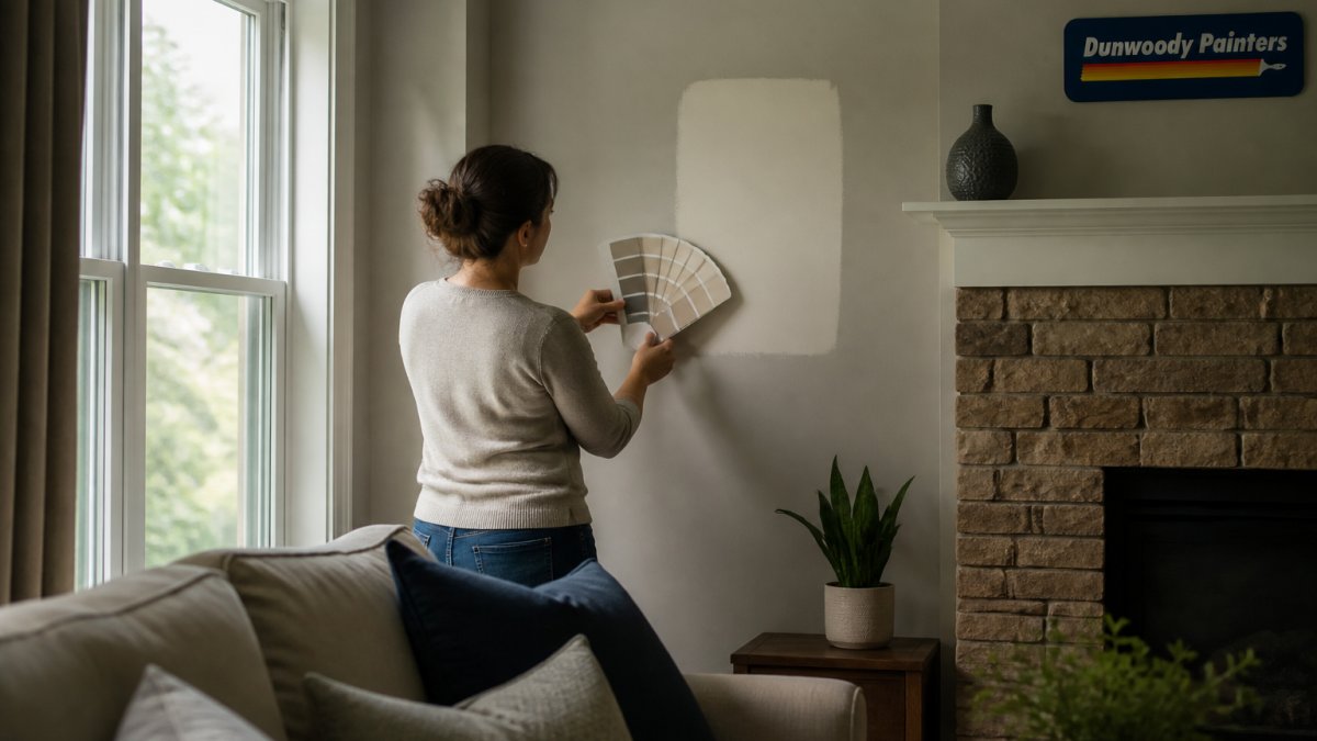
- Paint samples at least two feet square on two different walls and live with them for a full day.
Table of Contents
- Why Low Light Rooms Need a Different Color Strategy
- 7 Paint Colors That Work in Low Light Rooms in 2026
- The Best White Paint Colors for Low-Light Rooms
- Paint Colors for North-Facing Rooms and Dim Corners
- Choosing the Right Paint Sheen for Low-Light Rooms
- How to Make a Dark Room Look Brighter Before You Paint
- Schedule a Free Color Consultation and Estimate
- Frequently Asked Questions
Why Low Light Rooms Need a Different Color Strategy
The best paint colors for low light rooms reflect what little daylight you have instead of absorbing it. That principle explains why a color that looks crisp in a sunny kitchen turns muddy in a north-facing bedroom.
A dim room narrows your margin for error: shadows flatten contrast, mid-tones lose depth, and cool grays pick up a blue cast never on the swatch. For the wider regional picture, our guide to the best interior paint colors for Atlanta homes covers warm whites, greige, and muted greens that perform well in local light.
How Light Direction Changes a Paint Color
Light direction is the compass for every paint decision in a dark room. North-facing windows deliver cool, indirect light that pulls blue and gray forward and mutes yellow.
The practical takeaway: test your shortlist on the actual wall, in the actual room, at three times of day. A color that reads soft at noon can look gray and cold at 7 p.m.
Whole Building Design Guide guidance on daylighting and surface reflectance
7 Paint Colors That Work in Low Light Rooms in 2026
These seven colors each carry enough warmth or depth to survive a dim room. They are not the trendiest shades on the 2026 palette; they keep their character when the sun is not helping. Each entry pairs the wall color with a trim white and an accent so you can specify a complete palette instead of guessing.
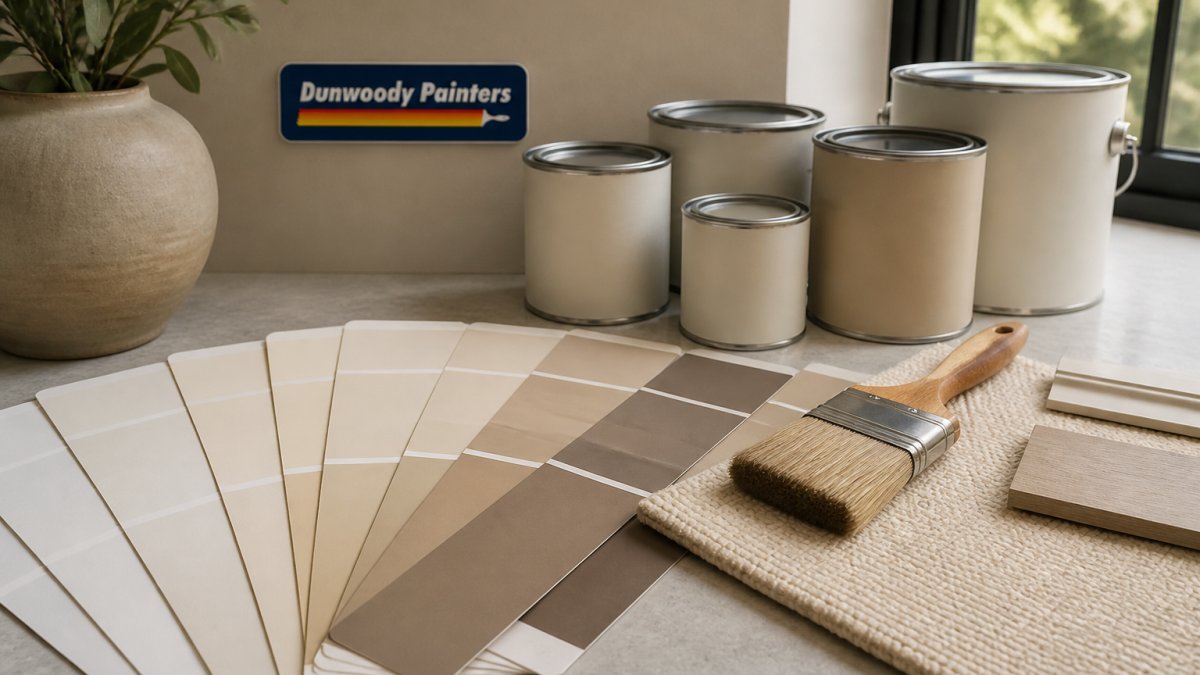
- Alabaster (Sherwin-Williams SW 7008), a gently warm white that brightens without turning stark. Pair with Pure White trim and a soft greige accent.
- Soft Chamois (Benjamin Moore OC-13), restrained warmth with little yellow, per homeowner reports. Pair with White Dove trim and a muted sage accent.
- October Mist (Benjamin Moore 1495), a warm gray with a subtle green cast. Pair with Simply White trim and a warm wood-tone accent.
- Marshlands (Benjamin Moore CC-512), an earthy green that grounds a room. Pair with Chantilly Lace trim and a cream accent.
- Seashell (Benjamin Moore OC-4), a soft neutral often raised in low-light discussions. Pair with White Dove trim and a pale blue-gray accent.
- Gravel Gray (Benjamin Moore 2126-50), a designer-favored gray for small spaces. Pair with Simply White trim and a warm white accent.
- Chippendale Rosetone (Benjamin Moore HC-58), a grounded, timeless neutral. Pair with White Dove trim and a deep olive accent.
Warm Whites: Alabaster and Soft Chamois
Warm whites are the safest starting point for a low light rooms strategy because they lift a dim space without going clinical.
For a complete warm-white scheme, use Alabaster on walls, Pure White (SW 7005) on trim and ceiling, and a soft greige like Repose Gray (SW 7015) on an accent wall or built-ins.
If warm neutrals are the direction you want, our roundup of the 7 best warm neutral paint colors for 2026 compares more options side by side.
Muted Greens and Warm Grays: October Mist and Marshlands
Green works in dim rooms when it stays muted and earthy rather than saturated.
A coordinated green palette: October Mist on walls, Simply White (OC-117) on trim, and a warm wood-tone accent such as natural oak or walnut furniture.
The mistake we see most often is choosing a green with strong saturation. In low light it goes dark and heavy fast.
Soft Blues and Grounded Neutrals: Seashell, Gravel Gray, and Chippendale Rosetone
Blues are the riskiest family in a dark room; the ones that work are pale and grayed rather than clear. Seashell (OC-4) appears repeatedly in homeowner discussions about rooms with limited natural light for exactly that reason.
Best for: rooms where you want calm and depth together. Skip if: the room gets almost no daylight and you want it to feel visibly brighter, in which case lean white.
Matching These Colors to Room Orientation and Light Level
Light direction changes how each of these seven colors reads, so match the palette to the room.
- North-facing or dim corners: lean warm. Alabaster, Soft Chamois, and Chippendale Rosetone hold their warmth under cool indirect light. Avoid the cooler grays and blues here unless you test them first.
- South-facing with strong afternoon sun: the warm whites can wash out by mid-afternoon. October Mist and Gravel Gray keep more depth when the sun is direct.
- East-facing (bright but brief): Marshlands and Seashell balance the short, cool morning light without going flat at midday.
A common pattern: one wall color for the main room and the same trim white throughout connected spaces, so a dim room does not read as a series of disconnected boxes.
The Best White Paint Colors for Low-Light Rooms
The best white paint colors for low-light rooms are warm whites with a touch of cream or beige, not bright whites with blue undertones. Cool whites look clean under strong sun and turn gray and shadowy in a dim room.
Three rules we apply when specifying white in a dark space:
- Pick a white with visible warmth, not a paper white
- Match the white to the bulb temperature in the room, since warm bulbs amplify warm paint
- Use the same white on trim and ceiling to avoid a hard contrast line that reads as gloom
Compare Alabaster against Pure White on your wall before you commit. Pure White is the more muted option, and in a dim room the difference between the two is bigger than the chips suggest.
Paint Colors for North-Facing Rooms and Dim Corners
Paint colors for north-facing rooms should lean warm, because cool, indirect north light pulls any cool color toward blue-gray. Dim corners behave the same way, only more so.
Dim corners are often bedrooms, and bedrooms reward restful color over bright contrast. If that is the project, our bedroom painting service covers restful palettes, low-odor low-VOC paint, and a tidy, fast finish.
Watch out: painting a north-facing room in a cool gray without testing it first is the single most common color regret we see.
Choosing the Right Paint Sheen for Low-Light Rooms
Paint sheen for low-light rooms should be flatter than in a bright hallway. Flat and matte finishes scatter light softly and hide the wall imperfections side light loves to expose.
Sheen is also a durability decision. Flatter finishes give softer light but are harder to clean; glossier ones wipe down easily but amplify uneven light.
Our default recommendation:
| Sheen | Light Behavior | Washability | Best Use in a Dim Room |
|---|---|---|---|
| Flat / matte | Soft diffusion, hides flaws | Low, spot-clean only | Main walls in low-traffic rooms, ceilings |
| Eggshell | Mild reflection, washable | Moderate, damp cloth | Family rooms, hallways, kids' rooms |
| Satin | Noticeable sheen | High, scrubbable | Trim, doors, cabinets, high-touch walls |
| Semi-gloss | Strong reflection, shows flaws | Highest, scrubbable | Trim and millwork only |
A practical middle ground is matte walls with an eggshell finish in the same color on the trim.
Finish Selection by Surface
- Main walls: matte or flat in low-traffic rooms; eggshell in family rooms and hallways where scuffs are likely.
- Trim and baseboards: satin or semi-gloss. The slight sheen reads as crisp against matte walls and wipes clean.
- Doors and cabinets: satin. It is scrubbable without the mirror-like reflection of semi-gloss.
Washability, Low-VOC, and Upkeep
Most major brands now offer low-VOC and zero-VOC formulas in matte and eggshell, so you need not choose between a soft finish and indoor air quality. Look for low-VOC or zero-VOC on the can, and check the EPA guidance on volatile organic compounds in indoor paints for what the labels mean.
Upkeep in a dim room is mostly touch-ups. Matte finishes blend into the surrounding wall; satin and semi-gloss show touch-up marks more readily.
EPA guidance on volatile organic compounds in indoor paints
How to Make a Dark Room Look Brighter Before You Paint
How to make a dark room look brighter starts with surfaces and fixtures, not the paint can. Fix the light first and you will choose a better color, because you will evaluate it under the conditions it will actually live in.
Work through this checklist before the first coat:
- Replace cool-white bulbs with warm-white LEDs in the 2700K to 3000K range
- Add a second light source so no wall depends on a single bulb
- Wash the walls and ceilings; grime dulls reflectance
Then paint large samples, at least two feet square, on two different walls. Live with them for a full day.
Schedule a Free Color Consultation and Estimate
Choosing color in a dim room is a judgment call chips cannot make for you. Our in-home color consultation brings large samples into your own light, picks sheen per surface, and leaves you with a written whole-home palette, so the decision is made once instead of repainted twice.
At Dunwoody Painters, every project runs on background-checked in-house crews, a detailed line-by-line estimate, and our no-payment-until-complete policy. If you want more palettes to browse first, our paint color trends and inspiration collection covers timeless neutrals and the shades that hold up best in Georgia light.
Frequently Asked Questions
What paint colors make a low-light room look brighter?
Warm whites and soft off-whites reflect the most light without turning gray in shadow. Alabaster and Soft Chamois are two examples that stay warm instead of going dull, and Pure White offers a more muted option. Pair them with a sheen slightly above flat, such as eggshell, so light bounces off the wall instead of soaking in. Avoid very dark colors on every wall unless you want the room to feel intentionally cozy.
Should you paint a dark room white or a darker color?
It depends on what you want the room to do. White and warm off-white make a dim room feel larger and lighter, which suits workspaces and hallways. A deeper color such as a rich green can make a low-light room feel deliberate and calm, especially in a bedroom. The mistake is choosing a mid-tone that reads muddy in shadow. Test both directions on the wall before committing.
Do warm or cool paint colors work better in low-light rooms?
Warm colors generally hold up better because dim light already reads cool and blue. A warm white or warm gray keeps the room from feeling cold, while a cool gray can turn flat and lifeless without direct sun. That said, north-facing rooms often benefit from a soft blue or green with a warm undertone. Check the undertone on a large sample, since a color that looks warm in the store can shift cool on a shadowed wall.
Does paint finish affect how bright a dark room looks?
Yes. Flat paint absorbs more light, while eggshell and satin reflect some of it back into the room. For low-light rooms, eggshell on walls is a practical middle ground: it adds a subtle bounce without the glare of gloss. Keep ceilings in a flat white so they disappear and feel higher, and use satin or semi-gloss on trim so edges catch the light. Bathrooms and kitchens can handle a higher sheen for cleaning.
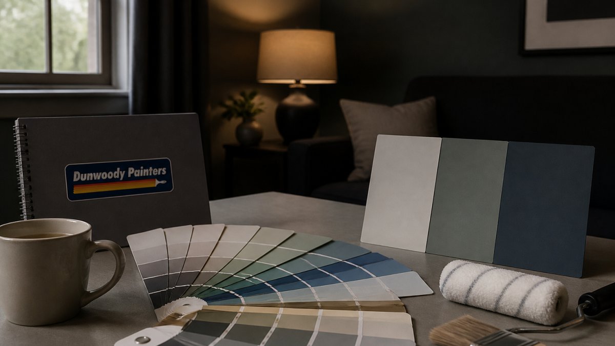
How can you test paint colors in a room with little natural light?
Paint large samples, at least 12 by 12 inches, directly on the wall and leave them for two to three days. Look at them in the morning, at midday, and at night with the lamps you actually use. Low-light rooms shift color more than sunny ones, so a swatch that looks right at noon can go gray after dark. Dunwoody Painters includes color guidance in its free, line-by-line estimate so you can settle on a shade before the crew arrives.
The hardest part of a dark room is not the painting. It is committing to a color you cannot fully picture until it is on the wall. Dunwoody Painters removes that risk with large samples viewed in your own light, background-checked crews, a line-by-line estimate, and a written 2-year workmanship warranty. Get started with Dunwoody Painters and schedule a free color consultation and estimate for your low-light rooms.