 blog
7 Modern Color Trends for Home Offices in 2026
Last Updated: October 24, 2026
Quick Summary
The modern color trends for home offices in 2026 balance focus and comfort, favoring grounded tones over sterile white. Warm neutrals, sage and rich greens, muted blues, and deep accents like charcoal and plum brown lead the way, with palettes built around the room's light and how you work.
- Warm neutrals like soft beige, mushroom, and clay keep a workspace open without the glare of pure white.
- Sage green works best as a full-wall color in smaller offices, while richer greens suit accent walls.
- Powder blue suits screen-heavy work because it reflects light gently and reduces harsh contrast.
- Reserve deep accents like charcoal and burnt umber for one wall or for cabinetry.
- Match the color to the task: sage, powder blue, or warm beige for deep focus.
Table of Contents
- Why 2026 Home Office Colors Balance Focus and Comfort
- 1. Warm Neutrals and Earthy Tones for a Grounded Workspace
- 2. Nature-Inspired Greens: Sage and Rich Botanical Shades
- 3. Muted Blues and Powder Blue for Calm Productivity
- 4. Deep, Dramatic Accents: Charcoal, Plum Brown, and Burnt Umber
- 5. Home Office Paint Colors 2026: Palettes That Work Together
- 6. Calming Colors for an Office: What Color Psychology Says
- 7. Home Office Accent Wall Colors That Add Depth Without Overpowering
- Frequently Asked Questions
Why 2026 Home Office Colors Balance Focus and Comfort
The modern color trends for home offices in 2026 have one clear theme: balance. Homeowners want a workspace that sharpens focus without feeling cold, and that means grounded tones instead of sterile white. We've watched this shift happen in real rooms across metro Atlanta. The best home office paint colors 2026 has to offer mix warmth with calm, and the result is a room you actually want to work in.
Here's the tension most guides miss: a color that looks great in a photo can fail under your actual lighting. So the right approach starts with the room, not the trend.
Below, we break down seven modern color trends and how to apply each one. We also cover how to choose paint colors for a home office based on light, orientation, and how you actually work.
1. Warm Neutrals and Earthy Tones for a Grounded Workspace
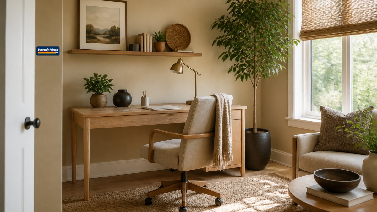
Warm neutrals and earthy tones are the safest bet for a grounded workspace. Think soft beige, mushroom, and clay instead of cool gray. These shades keep a room feeling open without the glare of pure white, and they pair well with warm wood and natural materials.
Why does this matter for a home office? Because neutral walls fade into the background and let your desk, screen, and decor carry the room. A common mistake is picking a gray that reads blue under afternoon light. Test a large sample first.
If you want specific named shades to bring to a paint store, our guide to the 7 best warm neutral paint colors gives you a shortlist to start from.
2. Nature-Inspired Greens: Sage and Rich Botanical Shades
Nature-inspired greens bring calm energy into a workspace. Sage green stays soft and quiet, while rich greens like olive and forest add depth. Both connect the room to the outdoors, which many people find steadying during long work sessions.
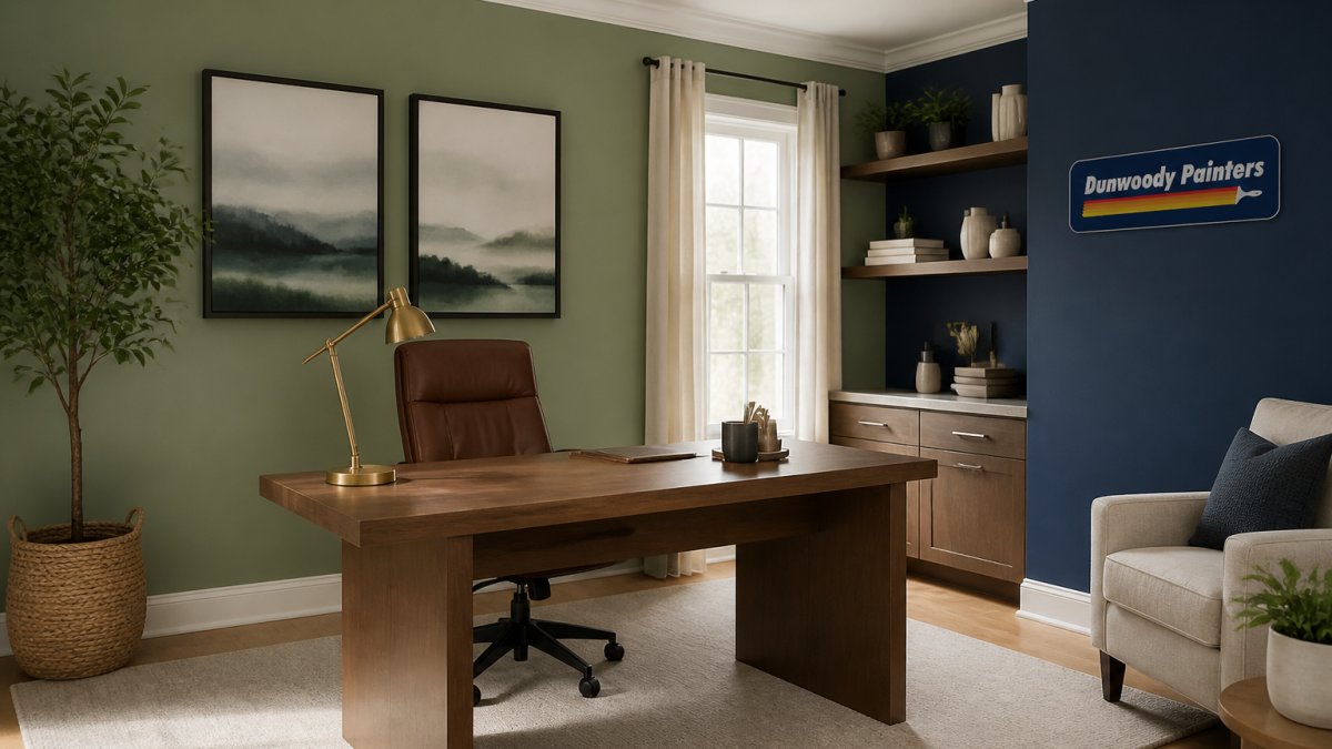
Sage works best as a full-wall color in smaller offices. A richer green suits an accent wall or a room with strong natural light. Pair green with warm wood and simple textures to keep it from feeling heavy.
One insider note: green shifts more than most colors under artificial light. Check your sample in the evening with your desk lamp on before you commit.
3. Muted Blues and Powder Blue for Calm Productivity
Muted blues and powder blue are the go-to choice for calm productivity. Powder blue and ice blue lower visual noise and feel clean without the chill of a bright navy. They suit screen-heavy work because blue walls reflect light gently and reduce harsh contrast.
Use powder blue on all four walls for a small office. For a larger room, a muted blue pairs nicely with warm neutrals on the trim. Dusty rose makes a soft companion accent if you want a touch of warmth.
The catch: blue can feel cool in a north-facing room. Add a warm rug or wood furniture to balance it.
4. Deep, Dramatic Accents: Charcoal, Plum Brown, and Burnt Umber
Deep, dramatic accents add seriousness and depth to a workspace. Charcoal, plum brown, and burnt umber create a focused, grounded feel, especially behind a desk or on built-ins. These deep accents work best in small doses so the room stays usable.
Reserve them for one wall or for cabinetry. A charcoal accent behind a monitor cuts glare and frames the desk area. Plum brown and burnt umber feel warmer and pair well with brass or wood details.
Watch out: deep colors show scuffs and patching more than light ones. A quality primer and a durable finish matter here.
5. Home Office Paint Colors 2026: Palettes That Work Together
Home office paint colors 2026 work best when you build a full palette, not a single shade. Here are three combinations that hold together across a whole room:
| Palette | Main Wall | Accent | Trim | Best For |
|---|---|---|---|---|
| Grounded Warm | Soft beige | Burnt umber | Warm white | North-facing rooms |
| Calm Focus | Powder blue | Muted blue | Soft white | Screen-heavy work |
| Botanical | Sage green | Rich green | Cream | Bright, sunny offices |
Start with the wall color, then pick an accent one or two shades deeper. Keep trim light to lift the room. Our paint color trends and inspiration library shows how office shades fit with the rest of your home.
If you'd rather not guess, our in-home color consultation lets you view large samples in your own light and leave with a written palette.
6. Calming Colors for an Office: What Color Psychology Says
Calming colors for an office tend to sit in the soft, low-saturation range. Color psychology suggests that muted greens and blues feel restful, while warm neutrals feel steady. Bright, saturated colors can lift energy but may distract during focused work.
The practical takeaway is simple: match the color to the task. A room for deep focus suits sage, powder blue, or warm beige. A room for creative work can handle a bolder accent.
For anyone who wants a restful room, our bedroom painting service uses the same calm-color approach with low-odor, low-VOC paint.
7. Home Office Accent Wall Colors That Add Depth Without Overpowering
Home office accent wall colors should add depth, not dominate. The best picks are charcoal, plum brown, burnt umber, and rich green. Put the accent behind your desk so it frames your workspace instead of competing with it.
Keep the other three walls quiet. That contrast is what makes an accent wall feel intentional. In shared spaces, use a softer accent so the room still works for everyone.
If you want more than flat paint, consider texture.
Frequently Asked Questions
What are the best paint colors for home offices in 2026?
The strongest choices for 2026 are warm neutrals like taupe and greige, nature-inspired greens such as sage and olive, and muted blues like powder blue. These home office colors create a balanced backdrop that supports focus without feeling sterile. For a bolder look, consider deep charcoal or plum brown on an accent wall. The key is to match the color to the room's natural light and your daily tasks.
Should a home office be painted a light or dark color?
Light colors generally work better for small offices or rooms with limited natural light because they reflect more light and make the space feel larger. Dark colors can be effective in larger offices or on a single accent wall, where they add depth and reduce glare on screens. If you take frequent video calls, a medium-light wall color offers the most flattering background. Test both options with sample swatches before committing.
Which colors help create a calm home office?
Calming colors for an office include soft greens, muted blues, and warm neutrals with low saturation. These shades reduce visual noise and help lower stress during focused work. Avoid highly saturated reds or oranges, which can increase tension. Pair calming wall colors with natural wood furniture and soft lighting to reinforce the effect. A color consultant can help you pick the right undertone for your room's lighting.
How do I choose a home office paint color that looks good on video calls?
For video calls, choose a matte or eggshell finish in a medium-light shade with a neutral or slightly warm undertone. Avoid pure white, which can blow out on camera, and very dark colors, which can make you look shadowed. Test your top choices by placing a sample board behind you and checking how it looks on your webcam in different lighting. Home office accent wall colors like soft blue or sage green often photograph well.
Ready to refresh your workspace with a palette that fits your light and your work? Dunwoody Painters brings background-checked crews, detailed line-by-line estimates, and a written 2-year workmanship warranty to every job. With no payment until the work is complete, you can update your home office with confidence. Get started with Dunwoody Painters and schedule a free estimate today.